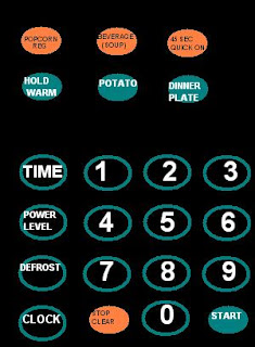
Due to my lack of camera, I have once again had to put my MS Paint skills to the test. Above, you will see a diagram of the microwave in my apartment. This microwave has many design flaws- I will describe a few.
The most obvious problem is with the basic microwave function. In order to cook/heat something, the user hits TIME, then the numbers, then START. The problem is that TIME could just as easily represent the clock display. The only way to tell that this is not the case is to notice the other button, CLOCK.
Furthermore, it is not clear that the TIME button serves any purpose. Pressing a number without first pressing TIME does nothing. Why not eliminate the TIME button, then?
Another confusing function is the DEFROST. Pressing the button brings up the following display: dEF2. The user can only guess what to do next. Pressing START does nothing. The user, in fact, has to push numbers, entering a decibel number between 0.1 and 9.9, then pressing START. What do these numbers represent? Even worse, entering any number above 4.0 yields an error. Why is the user allowed to enter higher numbers than are acceptable? This is an altogether baffling function.
A final, most annoying design flaw is the beeping after cooking. When the time is up for cooking something, the microwave beeps five times. Opening the door does not interrupt the beeping, forcing the user to endure the series of shrill beeps to its conclusion. The user will learn to avoid this, so they will often open the door seconds before the cooking is over, thus leaving an annoying second or two on the timer, which must be later cleared before the next cooking.

I think this outlines some of the biggest flaws in a common item which usually seems to be extremely poorly designed. I am sure everyone has had an experience where they went to use a microwave which they had never used before then felt like an idiot because they couldn't use it correctly.
ReplyDeleteThe defrost function is always a confusing part of a microwave and I don't think many people actually use it. Also the beeping is probably the worst part. I always open the door right before the beep.
Such a simple device should be equally as simple to operate. All of the extra features and the confusing button layout make many microwaves a hassle to use.
I wonder how many times (total, out of all machines sold) the potato button has been pressed. Hold warm actually seems pretty useful, doesn't it? I know my mom likes to plop things in the oven at around 200 degrees so that when I would come home from wherever, it'd be ready, without having to know precisely when I'd arrive.
ReplyDeleteI don't know how well that concept works with a microwave, but I feel that it's worth pointing out at least one good idea among many poor ones.
You should check out the microwave in the break room in Steinmetz - I don't think anyone has yet figured out how to cook for a particular amount of time - every button is an auto-cook. And most people don't notice the add :30 button, so it seems like you can only microwave in 1 minute increments.
ReplyDeleteMany microwaves are very confusing. i hate how on some microwaves you cant just type how much time and press go you first need to hit "time cook" which leaves the user hunting for the button. also i feel like most microwaves have too many features and many dont work, the popcorn button burns the popcorn on my microwave so i just stopped using it
ReplyDelete