I read the following article from the 2010 CHI conference:
http://research.microsoft.com/en-us/um/redmond/groups/cue/publications/harrisonskinputchi2010.pdf
It is entitled: Skinput: Appropriating the Body as an Input Surface. The article describes an input system for mobile devices that uses the skin as an input surface. The purported advantages of this system are that it is very compact/mobile, since the skin itself is always carried around anyway, and it allows for very intuitive use, since people have a natural spacial sense of their own body.
The system utilizes "bioacoustics". The user wears an armband on the upper arm containing an array of vibration sensors. When the user touches different parts of their arms, the sensors can detect, through vibrations in the skin and bones, where the user touched their fingers, hand, wrist, or arm. The researchers tested this input system by pairing it with projections on the arm in order to create keypads, scrolling menus, and other UI's.
I was surprised by the accuracy of the sensors in the system. The mobility, ease of use, and aesthetics of the Skinput system strike me as a natural next step in the progression of mobile technology.
Sunday, September 26, 2010
Monday, September 20, 2010
Blog Entry 2
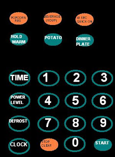
Due to my lack of camera, I have once again had to put my MS Paint skills to the test. Above, you will see a diagram of the microwave in my apartment. This microwave has many design flaws- I will describe a few.
The most obvious problem is with the basic microwave function. In order to cook/heat something, the user hits TIME, then the numbers, then START. The problem is that TIME could just as easily represent the clock display. The only way to tell that this is not the case is to notice the other button, CLOCK.
Furthermore, it is not clear that the TIME button serves any purpose. Pressing a number without first pressing TIME does nothing. Why not eliminate the TIME button, then?
Another confusing function is the DEFROST. Pressing the button brings up the following display: dEF2. The user can only guess what to do next. Pressing START does nothing. The user, in fact, has to push numbers, entering a decibel number between 0.1 and 9.9, then pressing START. What do these numbers represent? Even worse, entering any number above 4.0 yields an error. Why is the user allowed to enter higher numbers than are acceptable? This is an altogether baffling function.
A final, most annoying design flaw is the beeping after cooking. When the time is up for cooking something, the microwave beeps five times. Opening the door does not interrupt the beeping, forcing the user to endure the series of shrill beeps to its conclusion. The user will learn to avoid this, so they will often open the door seconds before the cooking is over, thus leaving an annoying second or two on the timer, which must be later cleared before the next cooking.
Sunday, September 12, 2010
Blog Entry 1
The diner begins at the entrance at the top-right of the diagram. The initial options are on the diner's right, at the top of the diagram. To the right of the grill, pasta. There is the grill making omelettes, and to the left of the grill, a variety of breakfast foods, with oatmeal at the end. Suppose the diner wants pasta. They will wait in the line, which extends out into the hall. Why is it taking so long? Because the line for the pasta is the same as the line for the grill, which naturally is very slow, since people must wait for their omelettes. Thus the diner who simply wants pasta must wait for omelettes as well, even though she does not intend to get one. Frustrated with the wait, the diner decides to skip pasta and get some oatmeal. The diner must first squeeze through the entryway at the top-right of the diagram, since it is blocked by the line for omelettes, then navigate the small strait between the grill and the central island. After squeezing between the two lines for the aforementioned areas, our hapless diner must awkwardly wait by the oatmeal. Naturally, people who have waited through the entire line should have first priority in accessing food here. So the diner waits for an opening, then darts in and grabs what they want. This issue is common, and the result is that students are constantly lingering behind the line at the grill, generating chaos and congestion.
This anecdote has already become too long, so I will conclude by pointing to some general problems. Unlike Upper Dining, West is circular. Upper provides food in a reasonable order, providing a linear path for diners as well as ample space for the indecisive and second-helping-getters to reinsert themselves into the path where they so desire. West, however, being a circle, forces diners to constantly backtrack. For example, a diner may want pasta from the grill, a drink from the drink station, and a sandwich from the sandwich line. The diner must wait in line for the pasta, then squeeze through to the drinks, then navigate around the central island, inevitably going against the flow of traffic, to get to the sandwiches. This might be tolerable if there was more room, but unfortunately the narrow conduits only amplify the congestion generated by West's disorganization. Dining Services has made repeated attempts to ameliorate these problems, but in this blogger's opinion they have not succeeded.
Subscribe to:
Comments (Atom)

